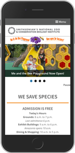
- Smithsonian National Zoo
usability report of the zoo's mobile website
usability report of the zoo's mobile website
Once users were on the primary level after leaving the homepage through the main menu, they tended to get stuck in that level due to the main menu not being visible once they scroll down.
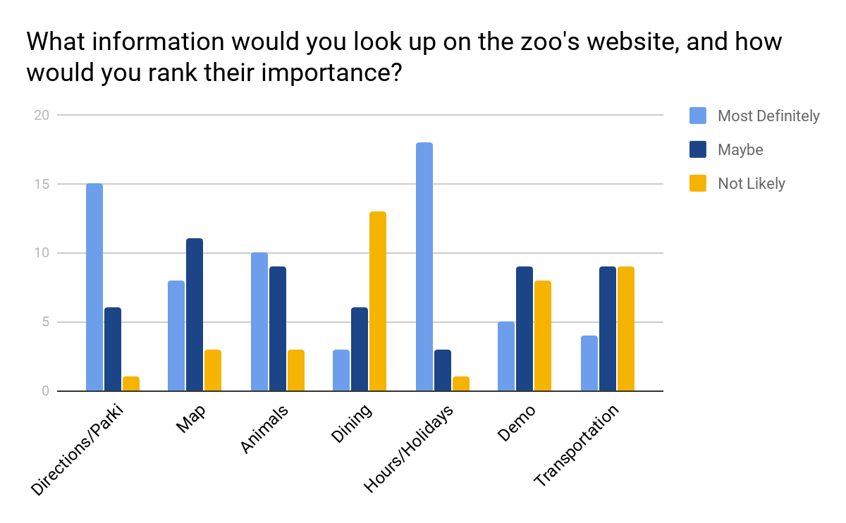
Users who were not on the Visit page often missed the scrolling "Daily Programs" schedule.
Users had a hard time finding shuttle information under the Accessibility section because they associated it with disability.
I tested with seven college students from ages 18 through 23. I used both an Android phone and an iPhone so I can get a better overall picture of the mobile website, or to see if there were any differences depending on the operating system.
I would like to acknowledge here that all participants were my friends because this was an unpaid internship, and I could not rely on guerilla testing to secure participants within the amount of time I allocated for the testing sessions (since the internship took place during school).
As such, the results of this study can only be generalized to tech-savvy young adults with a college education, which would only be a subset of all users of the zoo's mobile website.
On iPhone, there was a bug on the Animals A-Z page where if users tap on the ______ multiple times after choosing the type of animal, the site will throw a "" error.